Tuesday, October 9, 2007

... Or I Could Post This and Go to Sleep


Greetings, after your hopefully extra-long weekend. Mine, as you know, was especially-extra-long. A great wedding, and a great chance to see friends again (some thought lost), but I'm happy to be back sleeping in my own bed again.

This was originally going to be a post talking about some artists whose work I've come to admire (along with some other ramblings, I'm sure), but that got completely derailed when I saw the time. I really wish I knew why my body decided to reset it's clock to keep me up late, but oh well. If' I'm to be awake, I might as well do something creative. However, as I'm actually tired now, I'll make this relatively brief.

So, what we have here is a take off of the poster for Smokin' Aces, an early 2007 movie cast in the mold of a Quentin Tarantino movie. I was really psyched to see it when it was first released in the theaters. I remember walking out having enjoyed it, but still being vaguely disappointed in it. It wasn't enough of any one thing; in trying to be all types of movies, it succeeded in being none of them.

Cut to August 2007ish- having a few hours to kill, my roommate Dave and I sat re-watching the movie in the luxury of our own place. Having let go of any expectations for it this time around, I found myself enjoying it a bit more. Mostly enjoying it for the performances of the actors rather than the plot necessarily. And as these things will happen, we were watching one of the scenes in the movie involving a rabbit costume head, and either Dave or I said something about it being funnier if the Easter Bunny were involved. From there it was a short trip to the picture you see above. Something along the lines of Pulp Fiction by way of Hallmark Cards, with a healthy dose of poor taste, most likely. The original image was used very heavily to promote the film, and is very striking visually (like Lord of War, I think the poster was more successful than the movie itself). You can see the original poster here.

Though I'm posting this now, this was my first attempt at large-scale image manipulation using Photoshop. Hence the drawings dropping off the page (or not making it to the end of the page), along with the shaky coloring. Also, I can't draw a rectangle to save my freakin' life. All trapezoids, that's me.

So, there you go. Lessons learned here will hopefully be applied to projects further down the road.

That's about it for now. I'll be back Wednesday with some more movie goodness. Or at least, my idea of movie goodness. And maybe that bit about the artists. Or not.

Music: "Paralyzer" - Finger Eleven

Thursday, October 4, 2007

We're Coming to Get You, Barbara!


Yes, it's one of the most famous lines in Zombie Theater (okay, you probably can't name any other famous lines in zombie theater, but you know what I mean). But it's also a line in that most wonderful of romzomcoms, Shaun of the Dead. And it's uttered by this fellow, Ed. Um, of the dead.

Ed's the result of the 5-minute sketch- in fact, he's the original sketch, which I believe I did immediately after the original 'Bradstreet' drawing. The drawing was pretty much a snap- and it was totally inspired by my roommate Dave yawning. That look on Ed's face? Totally Dave. The rest of the drawing comes from the gang's attempts to infiltrate the zombie hordes by imitating them. I'm pleased by the picture overall, as it was pretty much exactly what I was thinking of initially. I again went through it with Photoshop, correcting some of the lines, and coloring it, obviously.

Alright, that's enough. I'm freakin' tired, and I have a long drive ahead of me tomorrow morning.

Cheers!

The ghost returns next Monday night...

Music: "When in Rome" - Nickel Creek

Wednesday, October 3, 2007

What I Did on my Fall Vacation


So, here's where I went over the past weekend. Chincoteague Island, VA, land of the ponies, and Misty of Chincoteague, and about a billion mosquitoes. It's a pretty nice place in the off-season, giving us all the chance to sit back and relax and enjoy the weekend, and each other's company.

Not to mention the sunsets.

This shot was taken Saturday off the back deck of the house we rented. You know how I spotted this sunset? I looked out the huge freakin' windows in the living room. Talk about a gorgeous view! It was pretty easy to just stare out the windows and watch the sun set. I have an easy dozen photos of two nights' worth of sunsets, and could have taken a hundred more. Sunsets were quite popular with the photographers amongst us. This photo was color-corrected slightly to bring out the sky, one of those things where I might be the only one to notice.

And yeah, we got shows like that every night.


This is April, one of the 'Chincoteague Ten'. Hanging out on the edge of the dock that came with the house. No alterations to the picture.

We also celebrated a big event for one of our friends. We had cake and balloons. It was a nice little party, though today is his proper birthday- Happy Birthday Thaddeus Maximus! I'd post pictures of the cake and card, but blogger has apparently had enough of me for tonight.

That's about it for today's non-drawing post. I should be back tomorrow with the second half of Tuesday's double feature, time willing.

Music: "Two Step" - Dave Matthews Band


Monday, October 1, 2007

The Zed Word


Hi everyone, and welcome back. I'm back from my mini-vacation, the annual trip to Chincoteague Island, VA. This makes our 9th(?) trip down- always a good time, always relaxing, and always making me want more vacations. Somewhere down the line, I might post some pictures from the trip- some of them turned out surprisingly well. Others... not so much.

Regardless, I'm back. This week is going to be an abbreviated one as well- I'm only in town for two days before I'm off again- this time, back to the home territories to attend my friends' wedding. I'll try to post tomorrow and Wednesday night, but no promises.

Anyway, to the good stuff. Above is the title character of one of my favorite movies of recent memory- Shaun, as in "...of the Dead". Shaun of the Dead is a fantastic movie on a number of levels: it is a hilariously funny comedy, a genuinely scary zombie movie, a clever satire of... oh, let's say modern society, and a glorious (and gory) homage to probably a dozen different movies. And, it's also an immensely enjoyable movie in its own right. Go check out imdb.com for more. But Shaun here, as I said, is the main character.

This sketch is actually the second sketch I've done for this movie, and also my second effort at a "5-minute drawing". But, chaos being the order of the day, this gets posted first. Essentially, these 5-minute drawings were meant as palette cleansers, so to speak, after I spent a long time working on particularly detailed sketches. Instead of taking a long time to agonize over every pencil line (easily done), I decided to take less than a minute to sketch out the figure, then a couple minutes more to flesh out the drawing, hopefully coming out with a finished picture in about 5 minutes. This forces me to 1) be decisive, 2)not second-guess and 3)commit to what I'm doing. And I'm just talking about drawings- if you think these are rules for living, you're crazy. So- the main advantage to drawing like this is the spontaneity- the pictures almost always look more "lively" if I don't spend a lot of time on trying to massage the lines into a more technically correct look. Also, this gives me a chance to work on a less "sketchy" look and use more solid lines. My natural instinct is to use many short lines to finish a drawing, rather than long flowing lines. For a master of the flowing lines, see Adam Hughes. Also by using fewer lines, it gives me a chance to work on conveying likenesses and expressions with less work- which, really, is what I'm all about.

Then, once I had the picture scanned in, I decided to go in and attempt to give it some color. In keeping with the cartoony nature of the picture, I opted for basic coloring (also because I'm still learning how to use the program). The coloring was NOT done in 5 minutes...

So, there's Shaun. Were you a fan, you might guess what's coming next. Whether or not it's colored depends on how lazy I am tomorrow. Place your bets now.

I'll be back on Wednesday.

Music: "Pet Sematary" - The Ramones

Wednesday, September 26, 2007

Art Department Strikes! Extra: Collaborating


As promised, an early post to finish out the week. I was going to start another 'theme' today (just finished the last touches) but thought better of it. Besides, I wanted to show this off.

This might look familiar (scroll down. go ahead, I'll wait.) See? It's the Iron Man picture I posted last week. But it's more than that. My friend Joey pulled the original picture off the blog and went to town on it with his own considerable Photoshop skills. Take a good look at it, then check out the original post. See how the light gleams off the armor? Joey did that. See how the armor actually goes from lighter to darker, giving it depth? Yep, Joey did that. Pretty cool, huh? That's what experience will do for you. I've been drawing for almost as long as I could hold a pencil, but I'm still new to the photoshop/digital art revolution. This is why I have friends like Joey and Dave to show me the capabilities of these crazy programs. And I'll tell you, it's wicked fun. Digital art is apparently the one thing that brings out a streak of meticulousness in me. I can spend a loooong time working a picture over, one pixel at a time. Thank god that doesn't carry over to anything else though...

Anyway, I just wanted to show off some of the capabilities of Photoshop, and more importantly, the joy of collaboration with your friends. In a way, this is a continuation of this week's theme of past projects, since the highlight of those was working with friends. Hopefully Joey will pick out some more art to work his photoshop magic on- OR HE WILL START HIS OWN BLOG TO SHOW OFF HIS ART.

just sayin'.

That's it for now- nothing new until... Tuesday? Let's say Tuesday. Have an excellent weekend, wherever you may be, or wherever you may be going. I will.

Music: "With a Little Help From My Friends" - The Beatles

Bonus Track: "Dreamline" - Rush (for the trip, of course)

Art Department Strikes! 2


Well Dan, I hope you're happy.

Continuing with this week's theme of "Art Department Strikes!" (not to be confused with 'UAW Strikes!' different stories altogether), here is another blast from my past. Conceived back in those heady days of college, this character was yet another half-formed idea that had no home. However, unlike most of the others in my notebooks, I gave this idea away to my friend Dan, in the hopes that he would do something cool with it.

(listens to sounds of crickets)

But, since he's been on my case for the past hmmm... 10 years to do something about any of the ideas I'd/we'd had back then, I figured he wouldn't mind if I borrowed the character back for a return visit.

Let's see if I can remember the gist of the character... oh, wait, I remember now. Pretty much I came up with the name, 'technopire', and left it at that. Pretty sure I couldn't copyright that... okay, a little more detail. I think I came up with the basic idea back in one of our biology classes back in the start of my college career. Something about a bunch of evil government scientists (my favorite kind!)getting their mitts on a real vampire, and attempting to make a supernatural predator into some manner of controllable weapon. Let's just assume for the sake of argument that the plan wouldn't work out and some manner of over-the-top action/violence would ensue.

That's about it, really. Yeah, honestly, a lot of these ideas weren't exactly groundbreaking or visionary. I kinda feel like the Jerry Bruckheimer of daydreamt story ideas. Except without, you know, money. Or connections. Or power. Or Kiera Knightley's cell number. You get the picture. But, they were a lot of fun to work on- again, that world-building I love so much. Even more fun was the collaborative process with my friends. It is a tremendous amount of fun to brainstorm with friends- ideas will build on top of ideas, and the craziest of them seem perfectly reasonable, and everyone is always more than ready to take it to even higher levels- things you would never have thought of, and things you only dreamt of, all seem to fall into place like they were meant to be, when working out these ideas with your friends.

That, my friends, is gold.

Oh, one last thing- he never had a name before. This one is an homage to a well-known comic and gaming artist, Tim Bradstreet. When I first started drawing this out, I was very definitely trying to emulate the stark, detailed style he's made his signature, while keeping it true to my own particular artistic quirks. And then I got all Photoshop on its ass. Visit Tim's site here.

I'll be out of the labs this Friday (even a mad scientist's ghost needs let out now and again, especially when it's to vacation with friends), so there will be no post then. However, since I like y'all, I'll post something up Thursday.

Until then...

Music: "Supernaut" - 10,000 Homo DJs (with Reznor vocals)

Sunday, September 23, 2007

Art Department Strikes! 1


A long time ago, I used to be a fairly imaginative guy. An 'idea man', if you will. As I mentioned in my first post, you could often find me around work with a scrap of paper (or cardboard) in hand, jotting notes down for one epic idea after another. The ideas usually came out in a plot form with lots of dialogue and scenes laid out (known as a 'scriptment' in Hollywood). They were to end up as either a story or as a comic book. I would usually catch on one basic idea (the "hook", if you'll allow the continued Hollywood analogy), then hang the plot around that. Sometimes the hook was nothing more than a quote I'd heard somewhere, or a basic question I wanted to answer. Then, characters to fill the needs of the story. Then, and this was my favorite part, the world-building.

One of the things I love best about books and comic books, and to a lesser extent, some movies, is the amount of world-building that goes into it. To me, the world-building is all of the history, science, culture, characters, and whatnot that goes into the world the story inhabits, but doesn't necessarily directly influence the story itself. This is most common in science fiction- Peter Hamilton's "Night's Dawn Trilogy", for example, uses some 600 years of future history to explain current events in the series, but only indirectly mentions those events. It's left to the reader to make the connections, and create the history. Some better examples of this world-building include J.K. Rowling's Wizarding world in Harry Potter (him again!), Gene Roddenberry's 23rd-century Utopia in Star Trek, and most famously, J.R.R. Tolkein's Lord of the Rings, in which Tolkein actually created the entire history of Middle Earth, along with languages, people, lands, etc., most of which never ended up in the main story.

I think the reason I love this part the best is that it makes those worlds feel that much more real to me- like it would only take finding the right road to wander down to end up in Middle Earth, or Godric's Hollow, or any of a thousand imagined worlds. So, I used to spend plenty of time developing the worlds my stories would inhabit- histories, technology, historical characters- all of them were worked out beforehand. To be honest, I frequently spent more time on the world-building than the story itself, which would explain the lack of actual stories.

Where was I? Oh, yeah, the picture.

I decided, since I was drawing again, to go back and revisit some of those ideas that had been rattling around either in my head or in a box somewhere for the past 15-20 years. This is the first of the sketches looking back at those old ideas.

This guy is called the Dragonheart. Why? Well, cause he has the heart of a dragon.

(Time for an aside- this name may sound familiar to you. "Dragonheart? Wasn't that some crappy movie from the mid-90's with Dennis Quaid and Sean Connery?" Why yes, it was. However, I actually came up with the idea for a character who possessed the heart of a dragon some 3-4 years before the movie came out. This happens an appalling amount of time to any creative types who focus on genre-specific stories. Oh sure, you can write an O. Henry-ending to just about any old movie and get away with it, but try to write another story with a guy who's got a dragon's heart and see if you can avoid the cries of "rip off!". sigh... welcome to genre entertainment...)

Anyway, this guy's got a dragon's heart for his own- and as a result, he's immortal, can throw around fire, and some other stuff I can't remember. His outfit is more an attempt to show he's been around a long time rather than any specific design/costume idea. It's meant to show a number of eras (pocket watch, armor pieces, etc.) And no, that's not a robotic arm- it's armor covering his arm. A cyborg magician? That would be silly... He's one of those times where I came up with a character, but he had no story to go with him. See, he had plenty of backstory, but no story. So, he languished, until I came up with another idea into which his story could play out. But, that's a tale for another time.

Alright, seriously, this went on longer than expected. Carry on now. I'll be back Wednesday.

Weekend viewing highlight: "The Fountain", by Darren Aronofsky, starring Hugh Jackman and Rachel Weisz. An amazing movie, and one I need to watch again, since I'm still not sure how I feel about it. Recommended.

Music: "Please Stay" - Warren Zevon (because of the movie)
Bonus cut: "Radio Nowhere" - Bruce Springsteen

Friday, September 21, 2007

Test Your Mettle


Today I'm rounding out this week's theme of "guys in armor" with the best-known armored comic book character, Iron Man. I've always been a big fan of Iron Man... or at least his armor. This picture came about mostly because I was looking for a chance to draw Iron Man, and I finally had a pose come into my head that worked for him. The armor is no particular era (Iron Man changes his design pretty darn frequently), but is probably most like his "Mark IV" armor (if anyone cares) which is the one most people who've seen the '60's cartoon would recognize. I'm pleased with how smoothly the picture came out, especially since this was the first time I'd drawn any kind of comic book character in some time. It's always a challenge to draw their over-defined musculature without making them ridiculous (setting aside the argument over the inherent ridiculousness of superheroes). They're always fun to draw, regardless of how muscular they are. The other goal of the picture was to get a sense of motion in the figure- I'm working to avoid making my figures look stiff and unnatural. Making them look like they're 'alive' is the hardest part of any drawing.


And here's me fooling around with Photoshop. I thought I'd give a go at coloring this one first- mainly because the lines were pretty solid on him, which made it easier to use the "paint bucket" feature to fill in large areas. The whole color job took about 5 minutes. Again, much to learn.

Nothing more to report here... have a good weekend, and I'll see you back on Monday.

Next week: Revisiting (very) Old Haunts, and the Return of the Art Department!

Music: "Flathead" - The Fratellis

Tuesday, September 18, 2007

"You're My Only Hope"


Another day, another knight. (I'm sorry, I just realized that's a pun...)

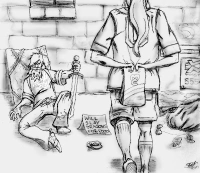
This image has been kicking around in my head for literally years. I first came up with the concept back in the early 90's, I think probably from having seen a number of shirts with "clever" sayings on them about what one would do for food (or beer, most likely). For whatever reason, the phrase "will slay dragons for food" leaped into my head, along with the general idea of the picture (kid, bum, food, shield). The one previous attempt at this was a total disaster, so the idea was set aside and more or less forgotten for the past 10 or 12 years, until this little Renaissance came about. The idea is the same as before, but it's all in the execution. For me, the real goal was to convey as much information as possible about the "story" in this one picture. I thought the best way to draw it would be to approach it from the girl's perspective, thereby letting the viewer in on her world a little bit. And this way, it gives us a chance to see the 'knight'. By the way- he might look similar, but he's not the wandering knight from the past post of the Grail Knight. I figured being homeless and being made to wander across Europe on a quest for the grail might leave a fella looking in a similar state of discomfiture.

Who is this broken down, obviously delusional homeless guy? What is he doing with a sword? And where are these so-called "dragons" he'll slay?

Ask the girl. She knows.

There's a story to be told in this picture, though even I'm not entirely sure what it is. I'm pretty sure it has to do with school, parents, mean classmates, self-confidence, failures, and redemption. And possibly dragons.

You should ask me about the tale of the snow dragon sometime. Talk about keeping an idea with you- try 25 years...

Oh- you'll also notice this picture looks a bit more "finished" than past efforts. I've been using Photoshop to clean up all the sketches (mostly for clarity and erasing extraneous marks on the paper) but this is the first time I've actually used Photoshop beyond its ability to change contrast and brightness. It's not much, but I like the texture it's given the picture. Now heaven help me when I start coloring with it.
New poll to the... right. Feel free to e-mail me with new poll topic suggestions (or comment below).

Alright, that's it- off wi' ya!

Music: "Hands Held High" - Linkin Park

Sunday, September 16, 2007

Scribblerian!


As you can see, sometimes, when I say 'sketch', I really mean "scribble". Aa much as I might wish otherwise, I don't always have a very strong idea of what is going to end up on the page when I sit down to draw. While sometimes ideas just spill out of the pencil, other times the ideas must be coaxed out, encouraged to find their ways onto the page, or bludgeoned over the head and dragged out. These two pages are good examples of what's going on all those times I lack the strong idea.

In the first instance, at least I had real(ish) life to draw on. On the way home from work one day, as I was driving through an intersection, I happened to look over and saw this girl sitting in her car, waiting for her light. Looked just like I drew her! Well, sort of. The glasses and hair were definitely right on. But, since that's all I had to go on, I made up the rest. This is known as "artistic license", my best friend. The evil scientist-looking guy on the other side of the page was initially nothing more than a few arced lines I had drawn down- testing out a head-shape, I think(ultimately not used for its original purpose). Anyway, a few days later, I was flipping through the sketchbook when I came back across the lines, and I started sketching in some more. Eyes first, then nose, then mouth. Once I saw how unpleasant he looked, he obviously had to be wringing his hands in an appropriate evil mastermind-way. And again, I really had no idea what was going to end up on the page until it was done. I like working like this- it keeps me from going back to the same well too often (intentional projects like HP aside). I often let the shape I sketch out determine what I'm going to continue drawing. "Function Follows Form", so to speak.

The second page is Kommandant Blitzendorf, an "idea" inspired in a roundabout fashion by a dinner conversation between myself and two friends of mine. All I'll say of the conversation is I have a tendency to occasionally intentionally mis-hear things (yes, intentionally), and it often gives me some pretty ridiculous ideas, or at least funny stories. This character is essentially a combination of Commandant Klink from 'Hogan's Heroes', Yosemite Sam, and Tim Conway's character Dorf. You really probably don't want to know any more than that, and perhaps I've already said too much. Also on the page is a very rough sketch for a figure of a cowboy-type figure. I couldn't get a solid lock on what direction I wanted to take that, so I shelved it for the time being.

The other thing you'll see on these pages are all the notes I leave myself. My mind wanders while I'm drawing, oftentimes to something else to draw further down the road. Since I can't do it all at once (that would be exhausting, then boring), I write myself notes on these convenient sketch pages so I can return to them later on if I'm looking for something in particular to draw. Or, if not an idea for a particular sketch, I'll write down something I've hear or seen or has occur ed to me- a story idea, or the background idea of a sketch, or the voices in my head, whatever. I'll say no more on these scribbles other than you'll probably see the results of these down the road.

That's about it for tonight. It's been a long day...

See you on Wednesday!

Music: "Earthbound" - Rodney Crowell

Friday, September 14, 2007

What is the secret of the Grail? Who does it serve?


And now, at long last, for something different.

You ever have one of those moments when you realize something, with complete clarity, down to the last detail? Whether it's a game being played, a puzzle being assembled, or whatever? One of those times when you have to just go with it, and trust it'll all sort itself out.

That's what this picture is.

Of course, it decided to hit me shortly after 1 am or so, after I was drifting off to sleep. Naturally, I got up out of bed, went downstairs, found my sketchbook and pencil, and came back up to draw it.

I really have no idea what brought on the images- I hadn't been reading or watching anything about knights, but there it was anyway. The dirt-covered, worn-out knight was standing there waiting for me to draw him. So I complied. Afterwards, I realized that the gist of the idea came from a scene from the movie Excalibur, specifically when the knights were on a quest to find the holy grail (or Holy Grail, if you like). Percival was the last of the knights questing; the others had died, either by their own hand, or by another's. Hence the hanged knight in the background. Percival was ultimately successful (wouldn't have been much of a story if he'd failed, right?)but in this image, I think he was wondering if it was worth the cost...

Anyway, it came together pretty well, though the image itself would benefit from being inked, or being photographed instead of scanned. There's a bit of detail lost, mostly in the sky. One more thing to learn.

That's about it for now. Next week: random sketches!

Have a good weekend- I know I will! (Behold the power of positive thinking!) (and the power of exclamation points... )

cheers

Music: "Secret Journey" - The Police

Wednesday, September 12, 2007

Nemesis


Just a quick note for a change. This is Draco Malfoy. Judging by his name, you can guess that he's not a nice guy. Draco is Harry's opposite number in Hogwart's. Imagine the most stuck-up, arrogant kid you can think of, and that's only the start to Draco. And of course, given J.K. Rowling, there's more to him than that.

Draco's sketch here was fairly easy to come up with. I figured he was never happy, and drew him like that. His hair was originally all slicked back, like sometimes done in the movies, but I didn't care for that. So, manga-hair instead.

This is the last Harry Potter-related sketch for a while; not because I don't have more, but it's getting too far out of order, chronologically. So, back in time we'll go...

See you Friday...

Music: "Double Agent" - Rush

Sunday, September 9, 2007

The Greatest Gryffindor


Greetings everyone, and welcome back.

Today, yep, another HP character (is it my fault there's like 3.5 million of them?). This unassuming fellow above is Neville Longbottom. In the books, Neville rarely gets much attention- in fact, he's usually played for laughs, accidentally causing some manner of damage to himself or otherwise serving as a source of humor. However, he is slowly revealed to be one of the most interesting and sympathetic characters over the course of the series. Like Snape, he is a character of hidden depth, though unlike Snape, Neville is always likable.

At first, Neville was a hard character to get a handle on. Matthew Lewis, who plays Neville in the HP movies, makes such a strong impression that it's hard not to instantly think of Matthew as the character from the book. He very much personifies Neville. I had set Neville aside to work on some other pieces (yes, what you're seeing is out of order) when I eventually took another thought at the character. What I liked most about Neville in the movie is that he doesn't look like a lead actor- he looks like a regular kid. So I tried to think of Neville as more of an "everyday" kid rather than as one of those kids everyone wanted to be growing up. Someone less photogenic, but more likable. I gave Neville more rounded features, and made him less slim than the others- he hasn't lost his baby fat, and probably won't. Neville looks like a softy. I tried to give him slightly larger, darker eyes as well, showing him as an open, straightforward kind of guy. Also, Neville ended up in street clothes rather than robes for some reason. Neville's favorite class is Herbology, so I figured he'd be holding some kind of plant- this is apparently some manner of magical sunflower.

Hope everyone's weekend was enjoyable. I went to the Baltimore comic book convention (or comicon) this Saturday with my friends Dave and Thad. As always, it was a very enjoyable time. I really like going, because it's a chance to meet the creators of some of my favorite comic books, as well as maybe discover some books I've never seen before. It was the opportunity to see artists in action, drawing sketches for folks left and right- from young hopefuls sketching for $10 up to pros charging multiple hundreds. A good gig if you can get it! I met some of my favorite artists, both new and long-time favorites. I've added links to their sites to the right.

This was also a special convention- this was the first comic book convention since the passing of Mike Wieringo (see my first entry), and it was the industry's chance to express its love for and appreciation of Mike. Judging by the events throughout the day, Mike made a huge impact on just about everyone he ever met, let alone worked with, in the industry. There were a number of vendors and pros who were in some way or another honoring Mike. Mike Wieringo loved animals, at least as much as he loved comics (and that's saying a lot). So, to honor Mike, creators teamed up with the convention showrunner to hold fundraisers all day long, with the intent to donate all the money raised to the Baltimore County Humane Society. Best of all, this is going to be an annual event. It was pretty awesome.

Oh- as you've all seen, I've been drawing a lot of Harry Potter stuff. Well, if you didn't know it, there are hundreds of other folks out there doing some amazing jobs drawing the characters. One woman I found on Friday just amazes me. Imagine Walt Disney making a HP animated movie, and you've pretty much described her style. They're fantastic pictures- I'm glad I only found them now, otherwise I'd have given up drawing them from the start! Check out some of her HP work here and more of her artwork here.

That's all for now! See you Wednesday...

PS You'll be happy to hear I've kinda/sorta started drawing some real people. You know who you are...

Music: "Keep Me In Your Heart" - Warren Zevon

Thursday, September 6, 2007

Trust Snape/Snape is a Very Bad Man


Back to Hogwarts...

Here are a couple different shots of the best character in the Harry Potter books, Severus Snape. Snape might not be a favorite character to many, but I think it would be hard to argue that he's not the best character in the books from a purely story point of view. Of course this means that you would probably all argue it, but it's my blog, so there. The reason I think he's such a great character is that, although he's supposedly one of the good guys, there is absolutely nothing good about him at all. He's arrogant, he's supremely self-confident, and he hates the hero of the book with a passion. And yet, he's trusted completely by the supposedly wisest character in the books. The question of whether or not Snape is really on the side of the good guys is a theme that runs through the entire series.

Okay, the pictures. This ended up being more of a set of ideas rather than a single defining sketch. Once I had abandoned my original idea for Snape (see Lucius Malfoy below) I knew I needed a different approach. For me, the idea that brought it all together was by giving Snape the white-on-black eyes. I'm not sure what made me come to that conclusion; it might be that Snape is very talented at hiding his thoughts from even the most powerful wizards. And, as they say eyes are the windows to the soul, I felt that the white-on-black would make for a nice image of shuttered "windows". Kind of convoluted thinking, but that's what I do.

The first sketch was the small one to the left- this was done to try to get a feel for how his face would look 'framed' by his hair. Snape is described as having stringy, greasy hair. Next, I went for the main headshot. This came across very well, I think. I wanted Snape to look very confident, almost condescending, but not actually evil or anything like that. I wanted him to look like he knows something very embarrassing about you, and he wouldn't hesitate in the slightest to use it against you. And again, the eyes. The last shot, the profile, was done to try to get a better feel for Snape's nose. I always imagine it as broken (it's described as hooked), and I like the idea of him looking down his nose with disgust at someone (most likely Potter). All in all, I'm very pleased with these shots- if anything were to be changed, I'd like to try for a more greasy look to Snape's hair, and maybe try to make him even more condescending and smarmy.

Also, there's a new poll to the right.

Baltimore Comicon is this weekend- you all know where I'll be now :) Have a good weekend; come back Monday for more Pottery. (sorry, it just typed itself out)

Cheers!

Music: "The Hand That Feeds"- Nine Inch Nails

Tuesday, September 4, 2007

Melancholy; or, a non-musical interlude, with music


I felt like posting again tonight (as I seem to be falling to Tuesday/Thursday/weekend rather than MWF), but not another set of HP sketches or something like that. So, here's a painting I did back in my previous attempt to rekindle the artistic fire, my watercolor class.

I found the original of this(and a number of other pictures) on Photo.net, a lovely place full of all kinds of pictures from many talented photographers. Something about this picture really struck me, and I thought it would be worth giving it a go in attempting to paint it. It is a deceptively simple photo- I mean, hell, it's snow, a guy, a tree, and water. But, it was exceedingly difficult to make look like it's meant to be seen. I'd say I've gotten about 70% of what I wanted out of the picture. The problem with the scanner is that it has a tendency to wash out the colors as seen on the page; this is probably why Dave suggests taking pictures of the pictures. But I am impatient and like playing with Photoshop. This image was orignally posted on my livejournal site.

As far as the picture, I really like it. It's a very stark and lonely image. This poor fellow, standing in the biting wind, wrapped up against the cold and the snow, is keeping watch out to sea, waiting for someone to arrive. There's a story in that picture. Maybe I'll tell you sometime. Maybe you already know it. Maybe you've told it yourself. That's what I saw in that picture.

That's all for now... see you on Friday.

Music: "Falling Slowly"- Glen Hansard and Marketa Irglova. The music itself sounds very haunting, the lyrics perhaps even moreso, yet still I find them uplifting. It makes for a good companion piece to the art.

Monday, September 3, 2007

Wonder Twin Powers...


Welcome back from the holidays.

Today I'm continuing with the HP sessions, so to speak. This time around I've got the scene-stealers of the HP books, Fred and George Weasley. Fred and George rarely take center-stage in any of the books, but are still very popular. They are unrepentant tricksters, always willing to test out some new trick on an unsuspecting victim. However, they are loyal friends of Harry. Anyway.

With these pictures, I was trying to hit a couple of notes. One, I wanted there to be some resemblance between these sketches and Ron; after all, they're family. I tried to use a similar jawline and nose as with Ron's picture a few days ago. Also, the freckles. Two, I wanted to get across some of the rebelliousness of the characters. Whereas I imagine most of the folks in the HP world to have longer hair (being out of touch with muggle styles), I wanted the Twins to have short, stylish haircuts. Fred's wearing a stylish dragon-skin coat, while George is wearing his Weasley's Wizarding Wheezes work-robe. Hopefully they look like they're full of fun and life, while being guaranteed to be pulling a fast one on you. And they're wearing bolo ties, for some reason...

A short post today, so hopefully I'll have something more to contribute next time around...

Music: "The Other Side of the World" - K.T. Tunstall

Wednesday, August 29, 2007

Supporting Roles


Yes, more HP. I swear, I have drawn other things.

These two disparate characters are Seamus Finnegan and Lucius Malfoy, pretty much opposite ends of the spectrum in the Harry Potter novels. Both sketches here came about indirectly- or, more to the point, I was intending to draw one thing, and this is what happened instead.

I was sketching out a pose for Neville Longbottom (HP character, of course)when I looked down at it and thought, "oh, that's Seamus." So I scrapped Neville (which is fine- I didn't have a strong enough idea of what he'd look like) and Seamus more or less showed up fully formed on the page. I have no idea why he's posing like that for a photo, but that's what he wanted to do.

The other sketch, Lucius Malfoy, was a bitch to get on paper. Mainly because it was actually supposed to be Severus Snape. I had a very definite idea of how I wanted Snape to be posed: head back, looking down his nose with contempt at someone (most likely some poor Gryffindor). So, it ended up on the paper, but the more I looked at it, the less i thought it was Snape. If anything, that sneer reminded me of Lucius Malfoy. Also, they eyes were too... smug, I suppose. Which, the more I thought of it, made me realize that's not the direction I wanted to go with Snape at all. So, a liberal application of eraser (Snape had a stronger jawline and a broken nose) some refinement of what was there, and viola! Malfoy the Elder.

Some brief notes:

If you'll look over amongst the links, you will see one called "Mark's Charity". My Brother Mark is collection donations as part of a Special Olympics fundraiser. If you can, please take a minute to donate. Every little bit helps.

Also- with the labor day holiday coming up, There will probably not be a weekend posting. However, I expect to be back here on Monday morning (or Sunday night) and so should still have a post up that day. Then again, you all know me...

For you uninitiated out there, if you're interested in learning a bit more about the world of Harry Potter, check out this link at http://en.wikipedia.org/wiki/Harry_potter . It has a nice summary of the books and what all the craziness is about. You muggles you.

Everyone have a good weekend- Enjoy the picnic and lack of laboring, and see you around.

Music: "Lazy Eye"- Silversun Pickups

Monday, August 27, 2007

How I Spent My Hogwart's Vacation, by Steve D.


Now, where was I?

Right, sketches, chronological order, stuff like that. Well, here we have the third (or fourth and fifth, I suppose) sketch done after having been re-bitten by the drawing bug. These are two of my favorite characters from the Harry Potter series, Ron Weasely and Hermione(her-MY-oh-knee)Granger. As you can see, my head was still overfull of HP-goodness, and I needed some kind of outlet.

For whatever reason, the main three characters are the ones I most easily picture differently from their filmic counterparts. For a lot of the characters, I often imagine them to look like the way they're portrayed in the movies. But for the three main characters, I usually see them differently. Which is not to say that these drawings are my final word on what they look like- this is just what ended up on the paper when I was drawing.

I would say these versions of Hermione and Ron are about 17 or 18... Ron's confidence has grown, but Hermione's tolerance for Ron acting like a child has not. And no, Ron's not giving Hermione the "piss off, fascists!" sign. He's giving it to someone else.

I'm fairly pleased with how they both turned out. I drew Ron first, then Hermione. Ron was initally just a head sketch, but when I put the smile on his face, I knew he needed to be gesturing something. Once I finished Ron, it only made sense to draw Hermione next, and her pose came fairly naturally put next to Ron. Hopefully some sense of her annoyance carries through in her look and pose. Maybe it was too many years of drawing angry superheroes or whatever, but I have a tough time conveying emotions on a sketch's face- other than anger or boredom. I now see why so many artists use photoreference for facial features. Or a mirror. Mirror's good.

I decided on making the HP characters look more cartoony for two reasons- one, at the time I wanted a very clean, strong line with them, and the cartoon aesthetic gives me that. Two, I wanted to approach the characters with a more realistic effort later on, but not then and there. I think I succeeded better with Ron than with Hermione because it's much easier to exaggerate facial features on a guy and keep him looking "handsome" than on a girl and keeping her "pretty". Or it is for me, at least. Even in drawing, women are a mystery to me...

coming up: more HP stuff.

For those of you worried this will be an HP love-fest, don't worry. I've got all kinds of other geekery waiting for you. And a list of more stuff to work on.

Since you're here, please take a moment to check out the poll to your right. I have a bunch of different ideas for things to draw, but I'd like to know if you (and you know who you are) would like to see anything in particular. Or at least as particular as the poll gets. Or feel free to e-mail suggestions. Bad ones will be ignored, good ones will be appropriated and claimed as my own.

See you Thursday.

Music: "Secret Garden"- Peter Gabriel

Saturday, August 25, 2007

Mike Wieringo


originally posted August 13,2007 at livejournal

Mike Wieringo died yesterday at the age of 44. Most people have no idea who he is, but to those of us in the know, Mike was a Titan among men. Mike Wieringo ('Ringo to his fans) was one of my favorite comic artists of all times. When everyone was grim and gritty with insane detail and more insane cross-hatching, Mike was drawing clean lines and fun characters. His art was lively without being cartoony. His art was NOT simple; most artists (and fans) know it's much harder to leave lines out than put them in. Mike was a master draftsman, and a master storyteller.

I didn't go out of the way to pick up Mike's artwork; I didn't need to. I was drawn to the type of books Mike evidently loved drawing. His defining runs on the Flash and the Fantastic Four? well, they just sounded like awesome books to me. And there was Mike, drawing some of the coolest characters in comics (when Mike drew the FF, they were COOL). He drew one of my favorite renditions of Spider-Man ever. He drew THE Flash- to me, everyone else's version is a pale shadow of his. He brought something different to each character he drew...

Nowhere is this more evident than in his sketches posted to his weblog. He would, as a warm-up, draw anything under the sun, at a level beyond most "finished" comic art ever hopes to be. and his imagination! Steam-powered Sherlock Holmes? check. Buck Rogers as a swashbuckler? check. Batman as an ape?!? check. and these were warm-ups!

Recently, i've taken up the pencil again, and find myself drawing quite often. A big part of my refound enthusiasm for drawing has come from looking at Mike's blog every day, and more often than not finding something new to ogle and wonder at. "where did he get THAT idea?" and "that's AMAZING!" were my most common thoughts while reading. Seeing what he could do in a few minutes made me want to get back into drawing. I wanted to be like Mike- i wanted to have his dedication to drawing, and more importantly, his love of drawing. So, in that regard, Mike is a huge influence on me. I hope i can keep it up.

I'm going to miss seeing his art on the stands and on the web... and everyone in comics is going to miss him.

(the sketch above is my very poor homage to Mike- one of his many creations that popped up on his blog- "the saturn kid", a character and concept i was insanely excited to see)

Mike's blog was the inspiration for this site, as well as a big influence on my approach to comic art in general. Mike's art is perfect for fans of any age- many of his drawings would fit perfectly in childrens' books or comics. I wanted to re-post this along with the link to Mike's website: mikewieringo.com and encourage everyone to stop by and take a look at some amazing art that will live on the web for years to come.

Have a great weekend. "Normal" posts will resume Monday.
Music: "I Grieve"- Peter Gabriel

Wednesday, August 22, 2007

Double-barrelled postings

I'm anxious to post more here soon, so here's a double post- scroll down for all the fun!

TOM AND HARRY


Alright, now we're getting to it.

Harry Potter and the Deathly Hallows came out while we were on vacation. And, being proper fans, we went out Friday night to pick up our copies at Midnight. So as you can imagine, we spent the next day reading, and reading, and reading. I finished it that night. Not to spoil for those who haven't read it yet, but it was EXCELLENT! So naturally, my friends and I spent much time that week talking about everything that happened in it, and our thoughts on the how and why and what next of it. My mind was full of thoughts and ideas about the Wizarding World of the Harry Potter books. I couldn't stop thinking about all the characters, and what happened to all of them. As I sat there with my sketchpad, looking to draw something, it wasn't much of a stretch to settle on the characters from the books.

One of the things I love about the series is the world-building that went on throughout each of the novels. Rowling managed to take a seemingly-thin concept ("kid wizards at school, right...") and made it a living, breathing, "real" world to millions. Not to mention what the movies have done for all the images she described. The great thing about novels is that they let us imagine for ourselves what everything described looks like. So, all of us have our own ideas of what Harry Potter, Dumbledore, or whoever looks like. But, I'd never thought to draw them before. And, since I was so itching to draw, this is what I started with.

I settled on a more cartoony style for the characters, for two reasons. One, less realism with the characters invites less comparison with the movies (as much as I love the movies, I don't always agree with what I see). Two, the image of Voldemort pretty much came fully-formed into my head before I even started sketching. And, as he doesn't look very realistic (for a back-from-the-dead snake-guy), I thought cartoony might be the better way to go. Optimally, I would have drawn this image of Voldemort using french curves.

Harry was another one who came to me pretty much fully-formed. There's really only three features you need to do a reasonable Harry Potter drawing: the Hair, the Scar, and the Glasses. So that's what I went with. Hopefully I managed to impart a little look of determination into the sketch. My thinking was this was a late-in-the-game Harry. And, again, the cartoony face. Less lines also means less opportunities to screw up. Imagining this image in 3D makes me think of some type of anime character with improbably pointy hair.

Expect more HP characters...

Music: "Flash Gordon (Theme)" - Queen


FIGURE STUDY


This was the first sketch I did while on vacation- it had been so long since I'd drawn anything at all (other than layouts for paintings), I really needed to warm up with a sketch. Basically, I needed to see that I could still draw. If I couldn't make a person look like a person, all the enthusiasm in the world wasn't going to help me any. This poor person had the misfortune to fall asleep. I'm pretty pleased with the sketch, though one of my weaknesses is placement- had I planned better, I would have turned the paper, thus avoiding the partial decapitation. A lot of times, I will find that the picture "gets away from me", taking on its own directions as it needs. layouts only get me so far, and the picture will frequently change as I get more lead onto paper. This is fine when sketching from imagination, less so when sketching from life. Something to work on.

Life drawings are a tricky business, particularly when you're attempting to achieve some manner of likeness. For me, likenesses are a happy coincidence when I'm trying to just get the form right. For me, and for many artists, I think, success is when someone can look at a drawing of yours and say, "oh, that's such-and-such". A skilled artist can convey likeness in just a few lines- Mike Mignola, another favorite comic book artist of mine, is well-known for his very minimalist style, often using and handful of lines to suggest features. Yet, his adaptation of Bram Stoker's Dracula had some of the most accurate likenesses to be found in comics.

I'm hoping to convince, cajole, or bribe some friends into sitting for some figure sketching at some point. Hopefully someone would be able to recognize them in my sketches.

Music of the Moment: "Supermassive Black Hole"- Muse